Friday, April 07, 2006
Not necessarily a good change....


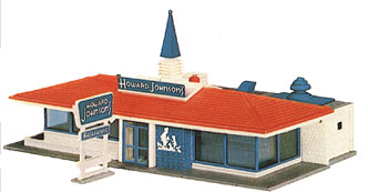
Over the years, of course, brands change their logos and style and sometimes they lose track of what they are known for. Remember when KFC quit having the bucket in their restaurant and then they started having it back and eventually put it back on their sign?? As a child I was FASCINATED by the old Holiday Inn signs--I loved it's gaudy flashy neon colors. I remember staying at one when I was little and waited outside until dark until I could see the sign "light up". I had put a post earlier about this on here, but thought it was stupid and delete it, but Steph said it was pretty good, so I will kind of put it back. Holiday Inn signs changed in 1983 to what we are used to now--the plain jane blah square sign. Another thing that I was commenting on is how Howard Johnson's or HOJO as it is now called, was known for its pointy orange roofs with orange and turquoise paint on the outside. I am very dissapointed in the new logo for Howard Johnsons--it is tres blah...Does anyone remember? Maybe like KFC, one day they will bring back the bucket or (gasp!) like Burger King, bring back the king.....Let's hope so for Americana nostalgic sake....
Comments:
<< Home
haha, I remember thinking the holiday inn was so fancy! I loved that pretty sign.
Do you remember that "BEAUTIFUL" shiny sign for tires across from C-mart? We thought that thing cost so much money!!! hahahahaha
Do you remember that "BEAUTIFUL" shiny sign for tires across from C-mart? We thought that thing cost so much money!!! hahahahaha

Yes, I remember that shiny sign--when I went to Branson for the first time, those shiny signs were everywhere--the ones with the shiny circles that reflected the light and shimmered when the wind blew--go figure! LOL
Post a Comment
<< Home
![]()